So…………………. ya.
First the designers of the 2012 London Olympics divided the seeing world with an awful looking logo. I get that the logo depicted the Olympic Village buildings but that isn’t a valid excuse for bad design.
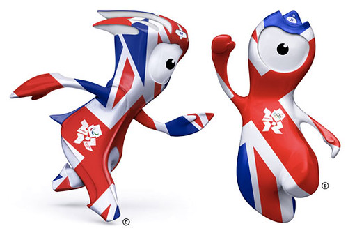
Now, here comes Mandeville and Wenlock. Worst. Mascots. Ever.
Collide Magazine summed up their arrival quite nicely. I don’t think I could have said it better myself:
“That’s Mandeville on the left and Wenlock on the right. Their job is to help prepare us for the 2012 Olympics by haunting our dreams and raising cyclops awareness … or something like that.” – Collide Magazine Blog
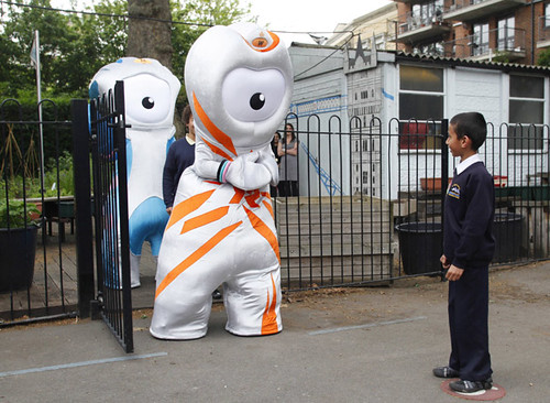
Actually, this is my favorite picture of the terrible duo:

This picture was taken just seconds before that young boy was mauled and eaten by these monsters. That’s the rumor I heard. And believe.
The good news is that the London Olympics don’t start for another year and a half so we can look forward to cowering in fear together until the torch is lit and the villagers hunt these creatures down and the games begin. I guess the Olympics does bring us closer together.
National Post: Horrific Olympic mascots Wenlock and Mandeville
Guardian UK: London Olympics 2012- Meet Wenlock and Mandeville, drips off the old block
Worst Olympic Mascots Gallery

